I've had a bit of trouble with Abbee the cat. I started out using a bristol paper, which doesn't have much "tooth", meaning it is quite smooth. I wasn't sure if I liked the texture and I wasn't sure the coloured pencil would layer nicely like I wanted. So I started another one of her on a different type of paper. In the end, I liked the original one better, so I went back to that. And as it turns out, the bristol paper layers quite nicely, as long as you go from light colours to dark.
By layering, I mean that when you use coloured pencil (or paints, pastels for that matter), you need to layer lots of different colours in order to get depth. For instance, if a cat is black, you can just use the colour black, but the drawing will look very flat. Instead, it's a good idea to use blues and purples (or any other colour) to add a sheen, and to make the coat look real. In the black/grey areas of Abbee's drawing, I used a combination of pinks, blues, purples and browns before I even added black. I'm quite happy with how the fur is looking so far.

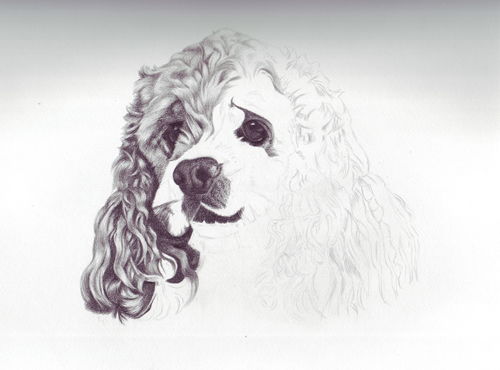
And here's Noah. I think he's coming along nicely as well.
No comments:
Post a Comment