
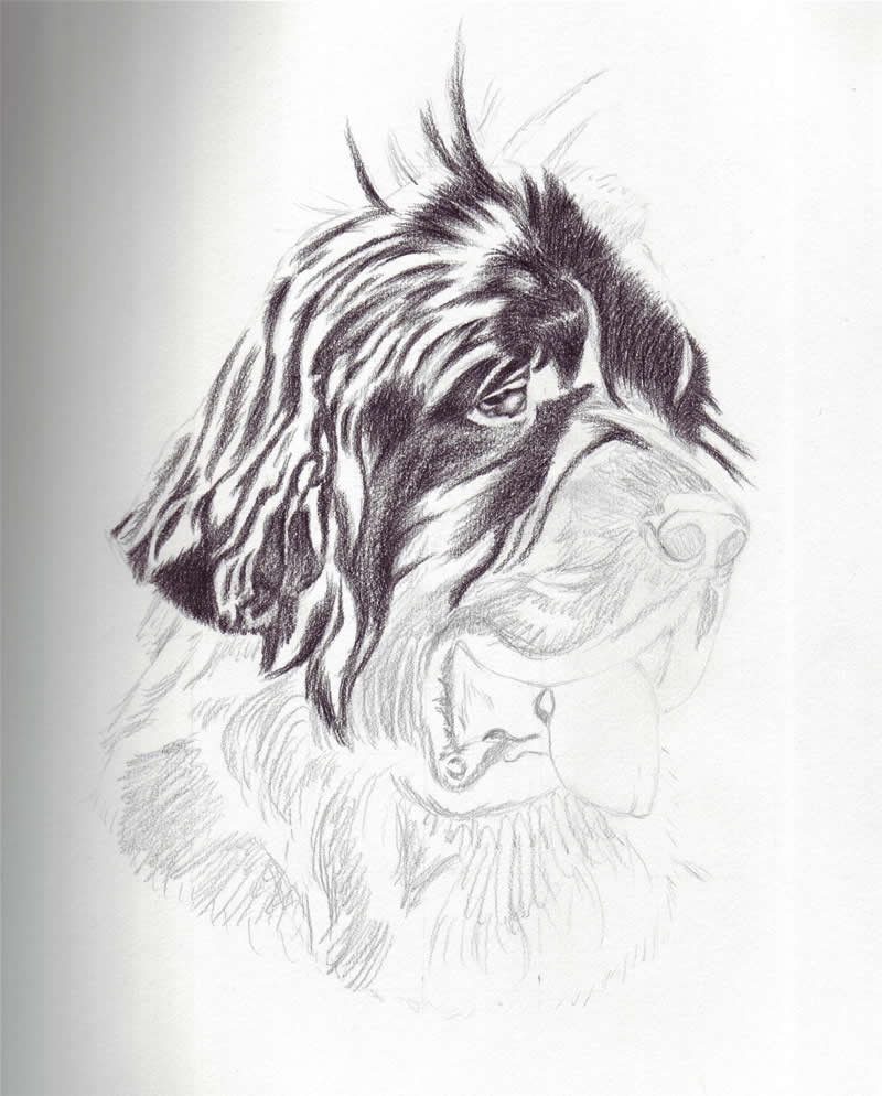
Here is the first stage of Paddy's drawing. So far I've drawn in the general outline, and I've started shading in the really dark areas of his fur. I like to do the dark areas first, and at the beginning of my drawings, there is a lot of contrast between the light and dark areas. This way, I am able to see the different tones easier. As I progress further into the drawing, I balance the different tones out, and make the dark areas darker.
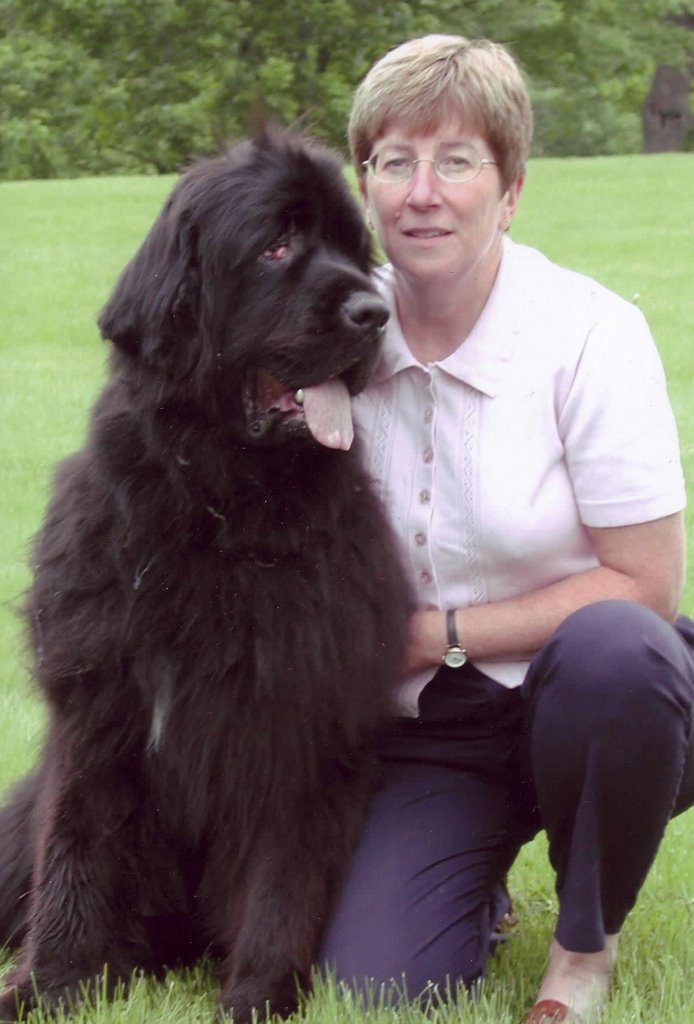
In the final drawing I like to exagerate the lights and darks a bit more than they are in the actual photo. I find this makes the drawing pop a bit more and makes it more interesting. If you draw the tones exactly as they are in the photo, it tends to make it a bit boring, especially when the animal is one colour, and you can hardly see the different shades. With Paddy, since he is black, I really have to look closely to see the different shades of grey.
No comments:
Post a Comment